Bbc News
@bbcnews·20.1M subscribers·32.9K videos
'I created the global-warming-stripes graphic' – BBC News
Posted
November 3, 2021
Views
22,425
Likes
446
Comments
192
Engagement
2.85%
November 3, 2021
22,425
446
192
2.85%
Every word spoken in this episode is indexed. Type any phrase to jump straight to the moment it was said.
Type any word or phrase that may have been spoken. Click a result to seek the player to that exact moment.
Try a name, a topic, or a quoted line
 3:29Now Playing
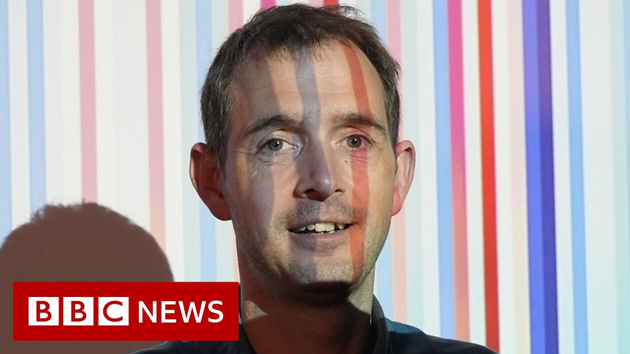
The creator of the warming stripe graphic says he's going to "need more colours" to represent future years in a warmer world.
From the catwalk at London Fashion Week, to the branding of the BBC News website, Prof Ed Hawkins' visualisation has become an international symbol of climate change.
Each line represents the average temperature for a year - blue for colder years and red for warmer.
According to Prof Hawkins, as the planet continues to warm as greenhouse gases are added to the atmosphere, the colours will get "darker and darker and darker".
Please subscribe HERE
#BBCNews #Climatechange #COP26
Sentinel Indexing in Progress
Metadata and chapters are available. Claim extraction for this episode is pending.
All video content is delivered via YouTube embedded players in accordance with the YouTube Terms of Service. Sentinel provides research tools that promote discovery and accountability across political media.